

- Startups Funding
-
Services
SERVICES WE EXCEL AT
TECHNOLOGY- Software Development and Custom Solutions
- E-commerce Solutions
- Gaming Development
- Product Design Services
- Cloud Infrastructure Setup and Management
- IT Consulting and Project Management
- Software Testing
- Machine Learning Services
- New Age Technologies Development
- AI Research and Development
- SaaS Development Services
- Technology Training and Workshops
OTHERSMARKETING- Lead Generation and Nurturing:
- Offline Marketing
- Content Creation and Management
- Email Marketing
- Content Strategy and Planning
- Online Reputation Management
- Brand Strategy and Positioning
- Market Research and Analysis
- Consumer Research and Insights
- Media Outreach and Relationship Management
- Crisis Communication Management
- Marketing Automation Strategy
- Marketing Funnel Development
- Customer Relationship Management (CRM) Integration
Bizionic, Startup to Unicorn’s Lab
Highly skilled software developers, designers, and marketers at one stop to build cost-effective solutions for business of all sizes, from startups to unicorns.
or email us at
For Tech Staffing:
Human Capital Management:hcm@bizionictech.com
For Sales and Collaborations:
Let's Build Together:info@bizionictech.com
-
Industries
INDUSTRIES WE SERVE
- Startups Ecosystem
- Real Estate
- E-Commerce
- B2B Solutions
- B2C Solutions
- Healthcare
- Travel & Hospitality
- Banking & Finance
- Media & Publishing
- Education and E-Learning
- Food & FMCG
- Automotive
- Retail and E-Commerce
- Manufacturing
- Telecommunications
- Energy and Utilities
- Government
- Nonprofits
- Professional Services
- SaaS (Software as a Service)
- Consumer Electronics
- Fashion and Apparel
- Agriculture
- Acceptable Policy
- Cookies Policy
- thankyou
Bizionic, Startup to Unicorn’s Lab
Highly skilled software developers, designers, and marketers at one stop to build cost-effective solutions for business of all sizes, from startups to unicorns.
or email us at
For Tech Staffing:
Human Capital Management:hcm@bizionictech.com
For Sales and Collaborations:
Let's Build Together:info@bizionictech.com
- Portfolio
- Blogs
- Get free Consultation
- About Us
-
Hire Talent
DEVELOPERS
HIRE BACK-END DEVELOPMENTHIRE FRONT-END DEVELOPMENTHIRE BLOCKCHAIN DEVELOPERSHIRE MOBILE APP DEVELOPERSHIRE DATA SCIENCEHIRE OTHER DEVELOPERSMARKETERS
HIRE MARKETING TEAM- Marketing Manager
- Digital Marketing Specialist
- SEM (Search Engine Marketing) Specialist
- SEO (Search Engine Optimization) Specialist
- PPC (Pay-Per-Click) Google Ads Specialist
- Social Media Manager
- Content Marketer
- Product Marketing Manager
- Influencer Marketer
- Market Research Analyst
- Public Relations (PR) Specialist
- Email Marketing Specialist
- Marketing Coordinator
- Marketing Communications Specialist
Bizionic, Startup to Unicorn’s Lab
Highly skilled software developers, designers, and marketers at one stop to build cost-effective solutions for business of all sizes, from startups to unicorns.
or email us at
For Tech Staffing:
Human Capital Management:hcm@bizionictech.com
For Sales and Collaborations:
Let's Build Together:info@bizionictech.com
-
Marketing
MARKETING SERVICES WE PROVIDE
MARKETING & MEDIALEAD GENERATION & CRO360 E-COMMERCE SOLUTIONSBizionic, Startup to Unicorn’s Lab
Highly skilled software developers, designers, and marketers at one stop to build cost-effective solutions for business of all sizes, from startups to unicorns.
or email us at
For Tech Staffing:
Human Capital Management:hcm@bizionictech.com
For Sales and Collaborations:
Let's Build Together:info@bizionictech.com
-
Technologies
TECHNOLOGIES WE MASTER
TECHNOLOGIESBizionic, Startup to Unicorn’s Lab
Highly skilled software developers, designers, and marketers at one stop to build cost-effective solutions for business of all sizes, from startups to unicorns.
or email us at
For Tech Staffing:
Human Capital Management:hcm@bizionictech.com
For Sales and Collaborations:
Let's Build Together:info@bizionictech.com
-
Cloud Consulting Services
cloud computing services
- AWS Cloud Consulting Services
- Azure Cloud Consulting Services
- Oracle Cloud Infrastructure (OCI)
- Cloud Migration Services
- Cloud Managed Services
- Hybrid Cloud Consulting Services
- Private Cloud Consulting Services
- DevOps as a Service
- IoT Consulting Services
- Backup Services
- Cloud Diaster Recovery
- Code Audit
- System and Technology Audit
Bizionic, Startup to Unicorn’s Lab
Highly skilled software developers, designers, and marketers at one stop to build cost-effective solutions for business of all sizes, from startups to unicorns.
or email us at
For Tech Staffing:
Human Capital Management:hcm@bizionictech.com
For Sales and Collaborations:
Let's Build Together:info@bizionictech.com
-
Security Solutions
SECURITY SOLUTIONS
CYBERSECURITY CONSULTINGDATABASE SECURITYAPPLICATION SECURITYCOMPLIANCE AS A SERVICECLOUD SECURITY
ORACLE(OCI)- Identity and Access Management
- Infrastructure security-Database using Data Safe
- Infrastructure security-Storage
- Infrastructure security-Compute
- Infrastructure security-Network Security
- Infrastructure security-Network-Load Balancer-Certificates
- Infrastructure security-Network-Firewall
- Key Management - OCI Valut
- Cloud Security Posture Management - Oracle Cloud Guard
- Application security - Web Application Firewall(WAF)
- Oracle Cloud Security Operations
Bizionic, Startup to Unicorn’s Lab
Highly skilled software developers, designers, and marketers at one stop to build cost-effective solutions for business of all sizes, from startups to unicorns.
or email us at
For Tech Staffing:
Human Capital Management:hcm@bizionictech.com
For Sales and Collaborations:
Let's Build Together:info@bizionictech.com
- Notification Center
- Startup Solutions
- Email Notification
- SMS Notification
- Careers
- Terms Of Service
- product-turkish-airline
- Openings
- product-american-hospital
- Startups Funding
-
Services
SERVICES WE EXCEL AT
TECHNOLOGY- Software Development and Custom Solutions
- E-commerce Solutions
- Gaming Development
- Product Design Services
- Cloud Infrastructure Setup and Management
- IT Consulting and Project Management
- Software Testing
- Machine Learning Services
- New Age Technologies Development
- AI Research and Development
- SaaS Development Services
- Technology Training and Workshops
OTHERSMARKETING- Lead Generation and Nurturing:
- Offline Marketing
- Content Creation and Management
- Email Marketing
- Content Strategy and Planning
- Online Reputation Management
- Brand Strategy and Positioning
- Market Research and Analysis
- Consumer Research and Insights
- Media Outreach and Relationship Management
- Crisis Communication Management
- Marketing Automation Strategy
- Marketing Funnel Development
- Customer Relationship Management (CRM) Integration
Bizionic, Startup to Unicorn’s Lab
Highly skilled software developers, designers, and marketers at one stop to build cost-effective solutions for business of all sizes, from startups to unicorns.
or email us at
For Tech Staffing:
Human Capital Management:hcm@bizionictech.com
For Sales and Collaborations:
Let's Build Together:info@bizionictech.com
-
Industries
INDUSTRIES WE SERVE
- Startups Ecosystem
- Real Estate
- E-Commerce
- B2B Solutions
- B2C Solutions
- Healthcare
- Travel & Hospitality
- Banking & Finance
- Media & Publishing
- Education and E-Learning
- Food & FMCG
- Automotive
- Retail and E-Commerce
- Manufacturing
- Telecommunications
- Energy and Utilities
- Government
- Nonprofits
- Professional Services
- SaaS (Software as a Service)
- Consumer Electronics
- Fashion and Apparel
- Agriculture
- Acceptable Policy
- Cookies Policy
- thankyou
Bizionic, Startup to Unicorn’s Lab
Highly skilled software developers, designers, and marketers at one stop to build cost-effective solutions for business of all sizes, from startups to unicorns.
or email us at
For Tech Staffing:
Human Capital Management:hcm@bizionictech.com
For Sales and Collaborations:
Let's Build Together:info@bizionictech.com
- Portfolio
- Blogs
- Get free Consultation
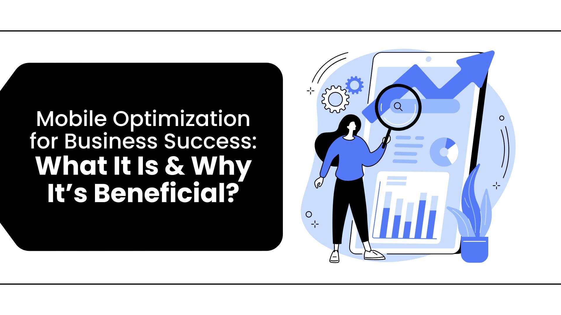
Why is Mobile Optimization Essential for Business ?
Most websites now include mobile SEO as a regular part. IDC says the smartphone industry is likely to grow by around 6% by the end of 2024 compared to last year. More and more people are using the internet on their phones. We can't assume that most people visiting your website use a full browser to see it. In this blog, we will explain what mobile optimization is and why it matters.
What does Mobile Optimization mean?
Mobile optimization means making your website or digital content work well on mobile devices like smartphones and tablets. This helps ensure that users have a good experience when they visit your site on these devices.
As more people use mobile devices, making sure your site works well on them is crucial for keeping users interested, reducing the number of people who leave quickly, and increasing sales. Here are some essential components related to mobile optimization.
How to Make Your Website Better for Mobile Users
Essential parts of a website that works well on mobile are:
• Responsive Design: Changes the website layout for various screen sizes and directions.
• Easy navigation on mobile: Makes the menu simpler to use on smaller screens.
• Quick page loading speed: Cuts down waiting time for busy people.
• Simple content: Text and images are arranged so they are easier to view on small screens.
• Easy-to-tap elements: Offers buttons and links that are simple to press with your fingers.
Why do all websites need this?
Better User Experience
Websites that work well on mobile devices give users a smooth and effortless experience on smaller screens. This works with more straightforward navigation, better reading, and more interaction.
Benefit: When users can quickly look at and use your content, they are more likely to stay and enjoy it, reducing frustration and increasing satisfaction.
More people are using mobile devices
More than half of all internet traffic comes from mobile devices, and this number is constantly increasing with time.
Benefit: By making your site better for mobile, you can reach more of your target audience and meet their needs, which can lead to more visitors to your website.
Better search engine rankings
Google uses mobile-first indexing, meaning it looks at the mobile version of webpages first when deciding its rankings.
Quicker loading times
People using mobile devices expect fast loading times. Websites that take a long time to load often have high bounce rates, especially on mobile devices.
A mobile-friendly website that loads quickly can lower bounce rates, keep customers interested, and boost conversion rates.
Better Conversion Rates
A mobile-friendly website makes it easy to find things, fill out forms, and complete purchases. This helps visitors do tasks like buying something, signing up, or asking for information more easily.
Benefit: Better usability leads to higher conversion rates and more sales for online stores.
Lower bounce rates
If a website does not work well on mobile devices, users are more likely to leave quickly, which leads to a high bounce rate.
Benefit: A design that works well on mobile devices helps users stay on your site longer. This lets them look at more pages and increases the chances of them getting involved or making a purchase.
To sum up
Remember that when you make things for mobile, you should think about:
• Bigger buttons
• Several screens
• Smaller images
• Location settings found automatically
 Mounika N
1 year ago
2024-10-08
Mounika N
1 year ago
2024-10-08
SERVICES
- Progressive Web App Development |
- Mobile App Development |
- Game Development |
- CRM Solutions |
- e-Commerce Development |
- Azure Services |
- Amazon Web Services |
- Data Science and Analytics Services |
- Enterprise Mobility Solutions |
- Cloud Consulting Services |
- Cyber Security |
- Cloud Infrastructure Setup and Management |
- Blockchain Development Services |
- AI Research and Development |
MARKETING
- Search Engine Optimization (SEO) |
- Pay Per Click (PPC) Services |
- Digital Marketing |
- UI/UX Services |
- Video Production |
- Content Marketing |
- Email Marketing |
- Influencer Marketing |
- Brand Marketing |
- E-Commerce Store |
- Payment Gateway |
- Voice Commerce |
- Chatbots Commerce |
- Customer Service Automation |
- Event Management |
- Campaign Monitoring |
- Layout Wireframes |
- Technical Analysis |
- Media Planning And Buying
TECHNOLOGIES
- Symfony |
- Drupal |
- MS Dynamics CRM |
- Salesforce |
- Sugar CRM |
- Shopify |
- SharePoint |
- Android Games |
- iOS Games |
- Website Development |
- Database Management |
- WordPress |
- Craft |
- Magento |
- Magento 2 |
- Quality Analyst |
- Unity 3D |
- Joomla |
- Opencart |
- WooCommerce |
- BigCommerce |
- NopCommerce |
- VirtueMart |
- Zencart
INDUSTRIES
- Startups Ecosystem |
- Real Estate |
- B2B Solutions |
- B2C Solutions |
- Healthcare |
- Travel & Hospitality |
- Banking & Finance |
- Media & Publishing |
- Education & e-Learning |
- Food & FMCG |
- Automotive |
- Retail and E-Commerce |
- Manufacturing |
- Telecommunications |
- Energy and Utilities |
- Government |
- Nonprofits |
- Professional Services |
- SaaS (Software as a Service) |
- Consumer Electronics |
- Fashion and Apparel |
- Agriculture